What Does Your Wine Label Say About You?
Much of the heavy lifting of a wine bottle is done by its packaging, whether it's a wooden box, a six-pack cardboard box, or, most importantly, the wine label.
A lot can be said about a wine, the vineyard, the vintage, the farming, the family, the soil or the cellar, but the label can make or break any of the storytelling. It suggests whether the wine is serious or casual, premium or everyday, traditional or contemporary.
This is the uncomfortable part for many wineries: the label is not just a piece of packaging. It is often the first act of judgement.
In the UK and international markets, we are seeing more wine label styles than ever. Some are classical and restrained. Some are graphic and architectural. Some are playful, colourful, ironic, and closer to craft beer. At Trellage, we believe this variety is not the problem. The problem is when the label does not match the wine, the target audience, or the winery’s brand personality.
Good wine label design is not only about standing out. It is about making the wine stand for the right thing.
The label is your first market signal
Wine is a difficult product to buy. Most consumers do not taste before they choose. They use signals.
The label, bottle shape, closure, weight, paper, typography, colour, region, and back label all contribute to the decision. Academic work of Diana Escandon-Barbosa and Josep Rialp-Criado on wine buying has repeatedly shown that extrinsic cues influence perceived quality and purchase intent. A study on wine bottle label content used a simulated supermarket with 100 wines and asked participants to view bottles for two minutes, showing how label information affects buying intention.
For expert consumers, the buying decision is not influenced by one label element alone. It is the combined effect of:
Denomination of Origin + Nutritional Information + Health Warnings
Complete research here:
Practical takeaway for wine branding:
For expert buyers, the label should not just look attractive. It should provide evidence: where the wine comes from, what is inside it, and clear regulatory or health information. For this audience, transparency builds trust.
That is why a label can make a wine look more expensive than it is. It can also make a serious wine look cheaper, louder, younger, safer, older or less distinctive than the estate intends.
That said, at Trellage, we also consider the broader aspects of the winery, this just one of the elements considered at the time of design.
For a winery, this is not solely a design issue. It is a positioning issue.

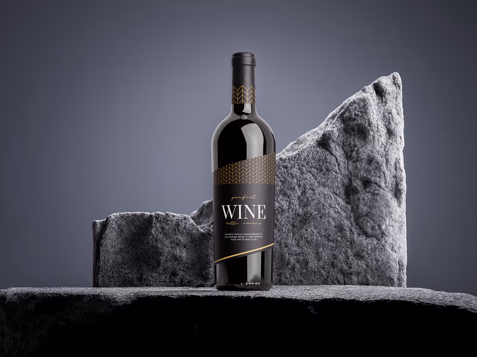
The Wine Label types
Wine labels can be grouped into eight broad styles. Not every bottle fits neatly into a single box, but consumers instinctively read labels by visual families.
Here is how the main styles tend to work.
Prestigious
Traditional-looking labels with strong use of black, gold, crests, seals and heraldic imagery. These labels suggest status, ceremony and gifting. They often increase perceived quality, but they can feel false if the estate has not earned those cues through history, scarcity or price.
Stately
Detailed labels with vineyard, château or estate imagery. These suggest tradition, place and reassurance. This style resonates strongly for attractiveness, especially in the UK. It works well when a winery wants to project rootedness and formal credibility.
Classic
Simple, clean labels with dark text on white or cream backgrounds. They communicate seriousness and restraint. The risk is sameness. For fine wine producers, this can be effective if the estate name already carries weight. For a new winery, it may be too anonymous.
Vibrant Classic
A bright dominant colour combined with classical typography or structure. This can help a winery feel more visible while retaining some traditional codes. The danger is that it can look like an attempt to appear premium without a clear point of view.
Contemporary
Stylised imagery, muted colour palettes, space and minimalism. This can work well for younger premium audiences and modern wineries that want elegance without old-world heaviness. According to buying decision science, black-and-white labelling could increase purchase intention by raising involvement and curiosity, particularly when paired with red wine.
Modern
Bright colours, modern images and limited text. Strong for shelf visibility and immediacy. It can help a winery feel accessible and current. It can also reduce signals of seriousness if the wine is trying to sit in a fine wine context.
Eclectic
A mix of characteristics that resists easy categorisation. This can be powerful when the winery has a strong artistic or founder-led identity. It can also become noise if the buyer cannot understand what the wine is trying to be.
Light-hearted
Humour, bright colour, bold illustrations and a deliberate move away from convention. This can create recall and conversation. The downside for fun wine labels that humorous elements can reduce willingness to pay and purchase intention in some contexts.
The point is not that Stately is good and Modern is bad. The point is that every visual style carries consequences.
The label must match the wine and the winery
We often see wineries fail to ask two basic questions.
First, does the label match the style of wine being presented?
Second, does the label align with the winery's brand personality?
A delicate, terroir-led Pinot Noir with a loud metallic label may create attention, but it may also create a contradiction. . A new estate with no inherited reputation may choose an ultra-classic label, hoping to look established, but instead disappear beside dozens of similar bottles. A case I often remember was for a winery from the New World that was experimenting with floor-matured Savagnin, a beautiful wine. What I remember was those wine labels, a mix of Prestigious and Stately styles, which would not resonate with the natural drinkers of that style. It was in brand, but it failed to reach the potential clients' idea.
This is why winery branding should begin before the label design starts.
A label should enhance the estate's personality. If the winery is scholarly, precise and rooted in a historic vineyard, the design language should support that. If the winery is young, experimental and trying to open a new conversation around a forgotten region, the label can afford more tension and surprise.
This is the same thinking explored in our article on wine brand personality.
Brand personality is not decoration. It is the winery's human character, made visible through behaviour, language, design and experience.
The label is where that character becomes physical.
Premium is not only material
Many producers focus on technical production details: paper GSM, embossing, foil, waterproofing, capsule quality, print finish. These matter. A label that scuffs, stains or peels in an ice bucket can weaken the perception of care.
But material quality is not the same as premium perception.
A thick paper stock cannot fix weak positioning. A gold foil cannot create heritage where none exists.
A heavy bottle cannot compensate for unclear brand personality.
Equally, one quick rule is worth stating plainly: very few premium wines are helped by looking overly metallic. Metal labels can work for spirits, nightlife products or deliberately futuristic brands. For fine wine, the chances of it landing where the producer wants are minimal unless the whole brand world is built around that code.
Premium wine typically demands depth, tactility, and confidence. Not just shine.

The route-to-market question
A label also needs to fit the channel.
A bottle designed for a sommelier-led restaurant list does not need to shout in the same way as a supermarket bottle. A wine intended for collectors must behave differently from a wine built for gifting, tourism, direct-to-consumer clubs or specialist independents.
Digital matters too. A 2023 study on bottle design and label position examined visual attention in digital contexts, reminding us that labels are increasingly judged on screens before they are handled in real life. The scale of this visual world is enormous. The WineSensed dataset, for example, contains 897,000 wine label images and 824,000 reviews from Vivino, showing how strongly wine is now interpreted through the relationship between image, language and perceived taste.
For wineries, the implication is direct: the label must work in hand, on shelf, in a merchant email, on a restaurant list, on a phone screen and in a distributor presentation.
That is not graphic design alone. That is market architecture.
The Trellage perspective
At Trellage, we believe a label should be judged by what it helps the market understand.
Does it support the price?
Does it reflect the wine style?
Does it express the winery’s brand personality?
Does it make the estate easier to remember?
Does it give the trade confidence to present the wine?
Does it create coherence across the website, sales materials, events and story?
A label is not successful because it is beautiful. It is successful because it clicks.
For fine wine producers, the label is an extension of the estate. It carries the vineyard, the history, the ambition, the intended audience and the price logic. It should not be left to personal taste alone.
The real question is not: do we like this label?
The better question is: what does this label make people believe about us?
If the label says the wrong thing, the winery may spend years correcting an impression it could have designed properly from the beginning.
Ensure your label tells the right story.
If you want to ensure your winery’s brand personality and label design are strategically aligned to resonate with your target audience, contact Trellage today.
Let’s discuss how we can help your wine stand for the right thing.